Modular card insurance in a banking app
Customers of BTG+, the bank's app, could only buy card insurance as a fixed bundle at one price. I designed a modular version: the customer chooses a level of cover for card theft and misuse, and adds an assistance, a service such as pet care or home repairs. My usability test then showed that selling it during the card request put card sign-ups at risk, so the whole flow moved to the card's settings.
Card insurance in BTG+ was a fixed bundle at one price. I designed a modular version, and my usability test moved it out of the card request into the card's settings, to protect card sign-ups.
- Role
- Senior Product Designer.
- Team
- PM, tech lead, developers, and Too Seguros as insurer.
- Context
- BTG+, the bank's digital product. October 2020.
- Contribution
- survey · benchmark · user flows · prototyping · usability testing · flow strategy
01 — Context & my role
BTG Pactual, one of Latin America's largest investment banks, was expanding into retail banking. Card insurance was one of the new products.
I designed it end to end: I ran the customer survey and a benchmark of other insurers, designed the flows and the prototype, and ran the usability test that moved insurance out of the card request.
Note · BTG Pactual
Two and a half years at BTG Pactual: I joined as a consultant on BTG+ and left as Product Design Lead on the advisors platform.
Also the context for An advisors platform for four business verticals.
02 — The problem
Almost every customer surveyed already had card insurance, and most were unhappy with part of it. The survey also showed that they wanted to choose the parts themselves.
A survey of 30 BTG Pactual customers:
Card insurance is usually sold as a fixed bundle, with no visible cost for each part. We wanted customers to build their package from modules: a level of cover plus assistances. Each module would show its limit and how it changes the price, and customers would follow a claim in the app.
In a fixed bundle, the limits of each part are buried in the policy's clauses, so customers can't compare the parts or drop the ones they don't want.
03 — Constraints
Part of the product belonged to someone else: the insurer set its rules. These are the limits every screen was designed within.
04 — Process & key decisions
The work had four stages: design principles, a benchmark of other insurers, the user flows, and the decisions that came out of testing.
Design principles
Agreed in a workshop with the PM, tech lead and developers. Later disagreements were settled by checking them against these three principles.
Benchmark
I reviewed seven insurers for how customers buy, customise and claim. Three of them shaped the plan-and-assistance structure described below.

Hedvig Hedvig lowers the monthly price when a customer invites a friend, and the new price shows at once.
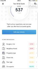
Wrisk Wrisk builds each policy from plain-language questions asked one at a time, so the cover fits the customer without a long form.
Shaped the structure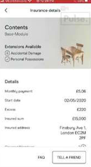
Pulse Pulse sells a base module with paid extensions, and the customer can share the cover with their household.
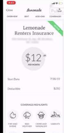
Lemonade Lemonade writes its contract in plain, friendly language, so the customer can read what they are buying.
Shaped the structure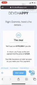
DeadHappy DeadHappy underwrites through a short conversation that ends with the payout and the price stated plainly.
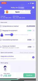
Cuvva Cuvva lets the customer raise cover item by item with sliders, and the price updates as they move.
Shaped the structure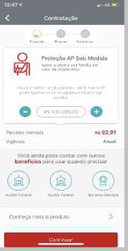
Santander Santander has the customer choose their cover before buying, and the instalment updates as they choose.
User flows
The three flows: buying the insurance, making a claim and cancelling.
The customer finishes the claim by phone with Too Seguros, the insurer, so the flow shows clearly the point where the app hands over.
Key decisions
05 — The solution
The customer finds card insurance in their card settings. There they compare three plans with their limits side by side, open each assistance module to read its details. Before accepting the terms, they see a confirmation that restates the plan, the price and the dates.
Card home. A customer who already has the card reaches insurance from the card's settings, outside the card request.
Why: Keeping insurance out of the card request keeps that request short, so more customers finish it.
Card settings menu. “Seguro do cartão” (card insurance) sits with every other card setting.
Why: The customer buys, claims and cancels in the same place, so they always know where to find their insurance.
Plan comparison. When the customer chooses a plan, Simples, Pleno and Superior sit side by side, each with its limits stated.
Why: The customer sees what each plan covers next to its price before choosing, because the policy's wording can't be changed to make it clearer.
Assistance selection. The customer picks from five assistance modules (pet, repairs, home, emergency services, bike), with Too Seguros named below as the insurer.
Why: Here the customer fits the package to their own life, and knows before paying which company provides the insurance.
06 — Impact
The usability test produced two findings: where insurance should sit in the app, and how customers read price changes.
Flow placement
Selling insurance inside the card request put card conversion at risk, along with the two other problems listed after the diagrams. So buying insurance moved to card settings, offered as a pending task once the card is approved.
- 01Request the card
- 02Benefits
- 03Invest+
- 04Virtual card
- 05Insurance plans + paid checkout
- 06Card conversion
Before: the card request carried five tasks in one journey, with the insurance plans and a paid checkout just before the customer submits the card request.
- 01Request the card
- 02Card conversion
- 03Pending taskCard insurance
- 04Card settings
- 05Seguro do cartãoContract · claim · cancel, one place
After: the customer finishes the card request first. Insurance has a permanent place in card settings, and paid plans are never sold in the same checkout as the free assistance.
Inside the card request, insurance put three things at risk:
- Card conversion, the retail business's key metric
- A checkout mixing the free assistance with paid plans
- A journey already carrying benefits, Invest+ and the virtual card
Price display
Customers understood the three plans, but were slow to notice how the price changed between them. So a short animation went into the build: when the customer switches plan, the price and limits update in place.
Switch plan in the figure to see the price and limits update.
07 — What I learned
Four lessons: two about the product, on placement and transparency, and two about the practice, on agreeing principles early and testing early.
08 — What this case doesn't cover
The case runs from the survey to handover for build. What came after that is not covered: